Meet the New MediaFire!

We live in a dynamically changing environment and it requires all of us to frequently review our standards and raise the bar. MediaFire is no exception. Even though our website has always been quite easy to use, we never stop looking for new ways to make things better! Release 7.0 is here, bringing some exciting changes to your MediaFire experience!
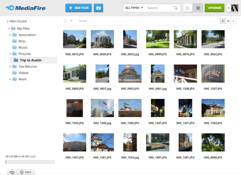
We’re thrilled to introduce a brand new design: the interface has been cleaned up and streamlined, and the overall color scheme is optimized to let you focus better on your content. You can still easily navigate all your files on your “My Files” page, add new ones, view them or collaborate – everything works as usual, except much cleaner and ready for the future!
Got pictures in your account? Go ahead and view them in our sleek new Photo Viewer! The dark color scheme creates a great contrast that makes your photo viewing experience much more sophisticated. Access all the photo viewing modes and options on the bottom of the page, or share, download, or save images to your MediaFire account (if shared with you by someone else) by clicking the button in the right top corner. Also, you can get this basic functionality by right clicking on the image being currently viewed.
We’ve also completely redesign the shared spreadsheet viewer to quickly and easily preview spreadsheet files. The new viewer supports all formulas, formatting and even graphs. Both the document viewer and the spreadsheet viewer are using a much more neutral palette helping you focus on the content you’re working on.
To retain the consistent look throughout the entire website, MediaFire has also redesigned the interface for editing files.
And one more little morsel of exciting news for all those of you who code: MediaFire now has a text and source code viewer and editor! View all text and source code file types, edit them, and share them in a new view specifically designed to emulate the look and feel of a fully featured text and code editor.
We hope this update makes your experience with MediaFire much more pleasant! We would like to thank every member of our MediaFire team who worked hard on this release, let us know how we did!
Stay tuned because there’s a lot more great stuff to come!
Leave a comment below, or visit us on Facebook, Twitter, or Google+.
The MediaFire Team


Looks great! One minor issue though, is that the top header color on user’s home and the header color of the download page (when a user visits a download link) are different colors. One is blue, one is grey. So those of us who can customize our logo can’t pick a single background color that works.
On a more serious note, email notifications when a user visits a 1-time download link no longer get sent.
Great job on the new design!
^^ hoo +100
Hey guys! You did really awesome work on new desing. And it seems to work much faster than previous ver. on my pc, which is rly awesome 😀
I love the new look! But, when will you guys be redesigning your blog? I think your blog itself needs a facelift! 🙂